Rewind, Replay, Rebrand: Remixing Music History with Peilin Li

Skip to Content

Inside Voices

Rewind, Replay, Rebrand: Remixing Music History with Peilin Li

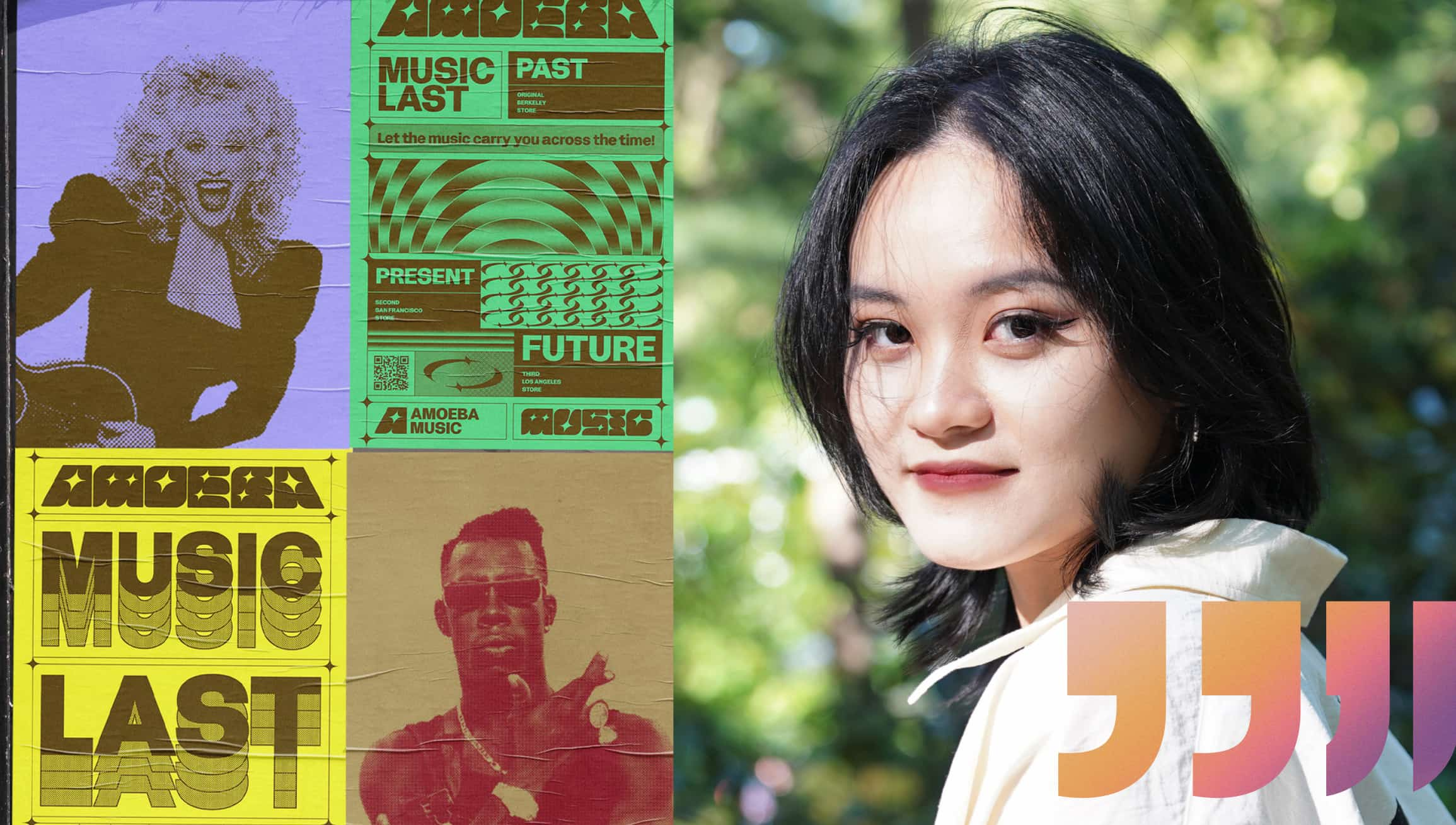
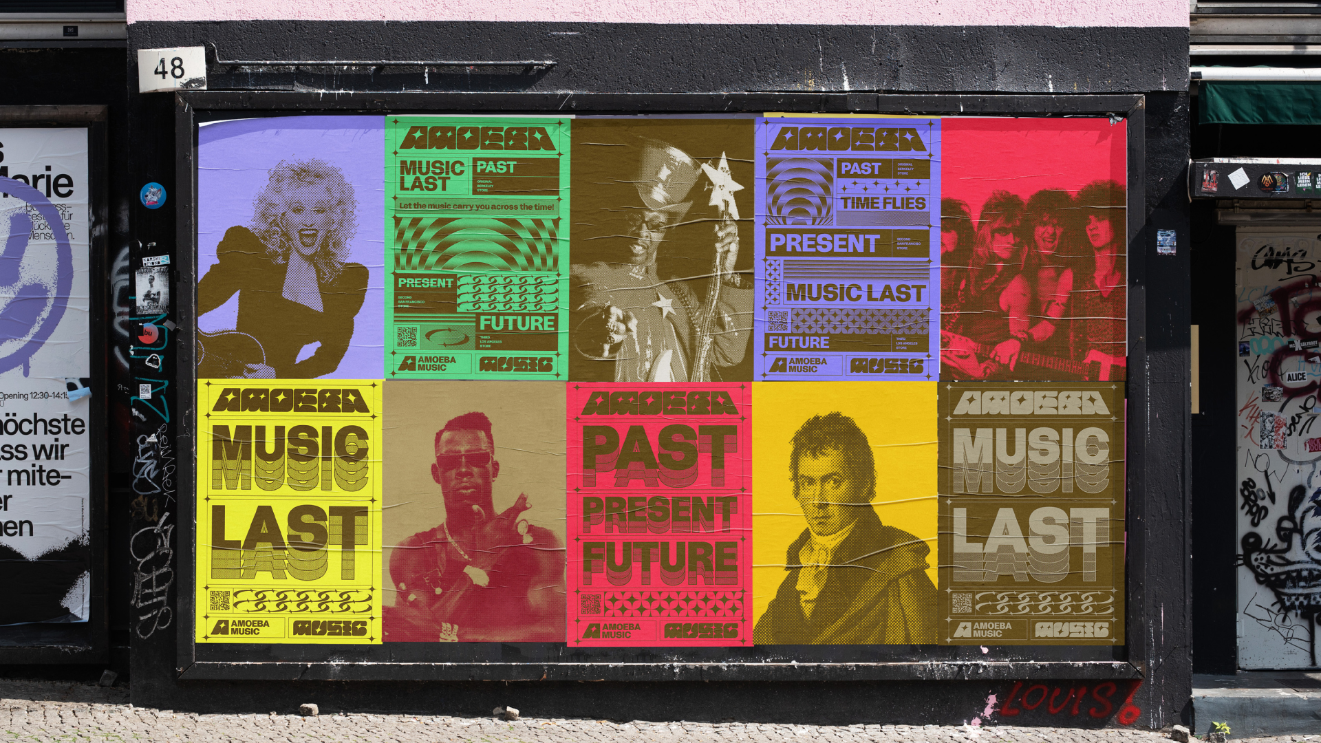
What if a record store could travel through time? That’s the idea behind Peilin Li’s concept rebrand for Amoeba Music, the legendary record store. Her posters bring music icons from every era, from classical composers to ’80s rockers, together in bold, bright color, like a time machine you can hang on the wall. The illustrator and designer at BUCK built it all around one simple tagline: “Time flies, music lasts.” The project earned the 2026 Award of Excellence – Print Advertising: Poster. Read the interview to see how Peilin finds the magic in moments most people overlook.

Your work sits right between illustration and graphic design. Which came first for you, and when did you realize you wanted to do both?
Illustration came first. I’ve always been drawn to its ability to tell a story or convey emotion through a single image, which led me to study illustration at the School of Visual Arts in New York. I later worked as a freelance illustrator on editorial and advertising projects.

Over time, I became interested in how different visual elements could work together as part of a larger visual system. That curiosity led me to pursue an MFA in Graphic Design at ArtCenter College of Design, where I began thinking beyond individual images and exploring how typography, color, layout, and brand strategy could work together to communicate an idea. Motion design opened up another dimension, allowing me to explore storytelling through rhythm and movement.

Today, I see illustration, graphic design, and motion as interconnected parts of my practice. Illustration brings emotion and storytelling, graphic design provides structure, and motion adds another layer of expression.

You find inspiration in small, everyday moments, like messy rooms or quiet pauses on a balcony. What’s an ordinary moment that’s stuck with you lately? And how do you translate that into your work?
I’m drawn to everyday scenes that suggest something has just happened or is about to happen. A messy dining table, plates slightly out of place, a chair that hasn’t been pushed back in, or a kettle about to boil. These details may seem insignificant on their own, but together they suggest a story beyond what we can see. It’s that sense of an untold narrative that I find fascinating.

I think this way of looking at the world goes back to my childhood love of picture books. I used to spend a lot of time studying the backgrounds and noticing details that were easy to overlook. Sometimes, what interested me most wasn’t the main character, but a small object tucked into a corner or a subtle gesture between characters.

That same curiosity shapes how I approach my work today. Through composition, scale, and color, I reinterpret everyday scenes to make ordinary things feel more playful and imaginative. I enjoy creating images that encourage people to look a little longer and notice details they might have missed at first, leaving room for them to bring their own experiences and interpretations to the stories within the illustrations.
“Time flies, music lasts” is such a strong idea to build an identity around. Where did the time-travel concept come from?
The concept grew out of my interest in the relationship between music, time, and memory. A familiar song can transport us back to a particular moment almost instantly, bringing back emotions and experiences we may not have thought about for years. In that sense, music has always felt like a time machine to me.

For the Amoeba Music rebrand, I was particularly inspired by the experience of exploring physical records. Unlike digital streaming, flipping through vinyl records feels like an adventure, with each record carrying stories from a different era. That experience of moving between different moments in music became the foundation for “Music Time Machine.”

I brought together retro and contemporary visual elements to express the relationship between past and present. The tagline, “Time flies, music lasts,” captures the idea at the center of the project: time continues to move forward, but the memories and emotions connected to music endure.

Walk us through your approach to the typography. What did you want it to say?
I’ve always been interested in how typography can express emotion, movement, and a sense of storytelling. My background in illustration, along with my interest in comics, has influenced the way I think about typography as a form of visual expression.

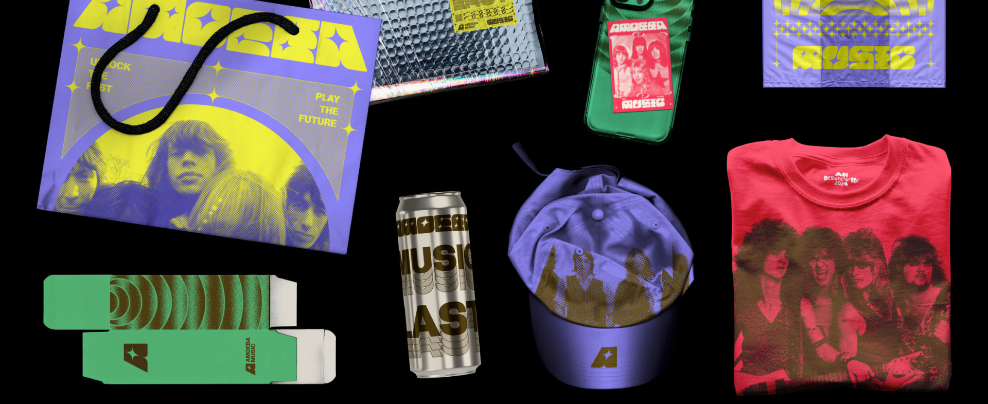
For the Amoeba Music wordmark, I used slanted letterforms and flowing curves to convey movement and rhythm, giving the typography a sense of energy that reflects the character of music. I carried that connection between music and visual expression into the tagline, “Time flies, music lasts,” combining contemporary typography with retro halftone textures to reinforce the relationship between different eras.

I also wanted the visual identity to reflect Amoeba Music’s vast and diverse, yet well-organized record collection. That contrast inspired the idea of “chaotic yet organized,” which I expressed through bold typography and a clear visual hierarchy. The typography brings energy and personality, while the hierarchy provides structure and keeps the identity cohesive and easy to navigate.

How did you land on the color palette, and what role does it play in the identity?
I approached the color palette as a way to express Amoeba Music’s energy and personality. One of the things I find exciting about exploring its record collection is the sense of unexpected discovery, and I wanted to bring that same feeling into the color palette.

I used highly saturated colors to make the identity feel bold, contemporary, and playful, while also appealing to a younger audience. Contrast has always been an important part of my visual approach, so I paired these vibrant colors with retro textures to balance contemporary energy with a sense of nostalgia.

This combination brings together the energy of contemporary design and the familiarity of retro visual elements, reflecting how Amoeba Music connects different musical eras and generations.

What do you hope people feel when they encounter the Amoeba Music rebrand, and why do you think it resonates the way it does?
I want people to feel curious and excited when they encounter the identity, almost as if they’re stepping into another world. That’s how I think about the experience of wandering through a record store, never knowing what you might discover next.

What makes Amoeba Music special to me is that it’s more than a place to buy records. It’s a space where people from different generations, with different musical tastes and personal memories, come together. I wanted the design to capture that same sense of discovery and connection, which I think is part of what makes the concept resonate with people.

Music is deeply personal, but it also brings people together. Even as the way we listen to music changes, that emotional connection remains. Ultimately, I hope the identity inspires people to explore and discover music for themselves. If the design reminds someone of a favorite song, encourages them to discover a new record, or simply makes them want to explore Amoeba Music, then I’ve achieved what I set out to do.


Is your work headliner material? Prove It. Enter your best projects by November 13th to save with preferred early pricing.


Get the Newsletter